On Post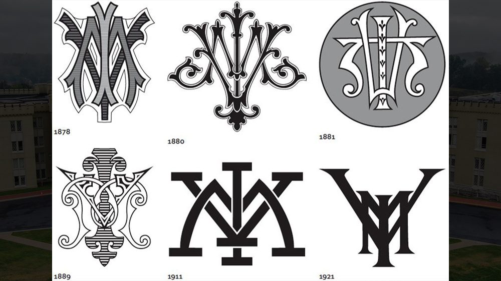
VMI Logos Change with the Times
VMI logos have changed over the years. Above are logos from 1878-1921.—Graphic courtesy of VMI Communications & Marketing.
VMI logos have changed over the years. Above are logos from 1878-1921.—Graphic courtesy of VMI Communications & Marketing.
They’re everywhere now—on water bottles, billboards, and stadium seat cushions, even onesies for babies. College logos are big business, producing multimillion-dollar revenue streams for the largest schools.
At VMI, the familiar spider-shaped logo made out of the intertwined letters is as familiar to members of the Institute community as the shape of the barracks seen through the morning fog. But has VMI always had its current logo? And who came up with the idea of putting letters together to form a logo in the first place?
Answering those questions, Col. Keith Gibson ’77, director of the VMI Museum System, tells a story of 19th-century innovation in the form of a cipher—a mark deliberately meant to convey meaning to the initiated while puzzling outsiders. Even Queen Victoria had a cipher, Gibson noted. The mark of royalty soon appealed to commoners, as well, and the popularity of the cipher spread.
“The VMI cipher of the 19th and early 20th century took on an enormous variety of very creative and artistic interpretations,” said Gibson. Cadets were free to design their own ciphers or ones representing their class, and many did so, with the emblems adorning invitations and dance cards. Graphic artists at printing firms likely also assisted with the creation of ciphers.
The earliest cipher dates from the late 1860s, and many late 19th century ciphers are quite elaborately drawn, with flourishes and other enhancements reflecting the tastes of the Gilded Age.
“[The ciphers] very much capture the aesthetic of the period in which they’re found,” said Gibson.
By 1900, intercollegiate athletics were becoming increasingly popular, and the need for sports teams to be instantly recognizable made the cipher a natural fit. The football team first wore the intertwined letters in 1901.
Around the same time, the Institute adopted its colors of red, white, and yellow, and the familiar scheme in which each letter is a different color began. Gibson explained that the Army only had three combat branches at the time, so red was chosen for the artillery, white for the infantry, and yellow for the cavalry. All the 19th-century ciphers had been black and white only.
In 1922, the familiar shape of today’s logo first took form, with a yellow V, a red M, and a white I. The trademarked logo of today, with the words “Virginia Military Institute” in black letters surrounding the logo in a circle, was adopted in 1989 on the occasion of the Institute’s 150th anniversary.